Maybourne

Overview
Six luxury hotel brands, a parent corporate platform and one shared booking experience, all losing bookings to third-party channels the group didn't control.
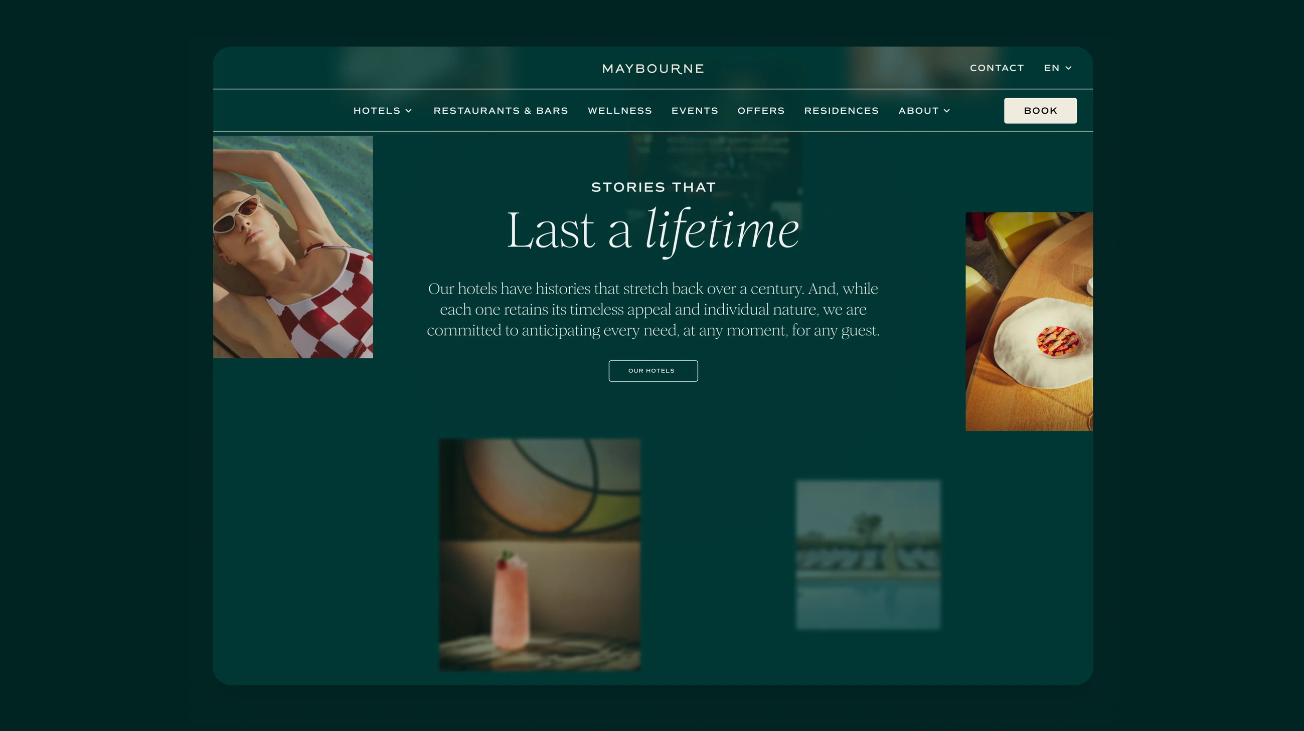
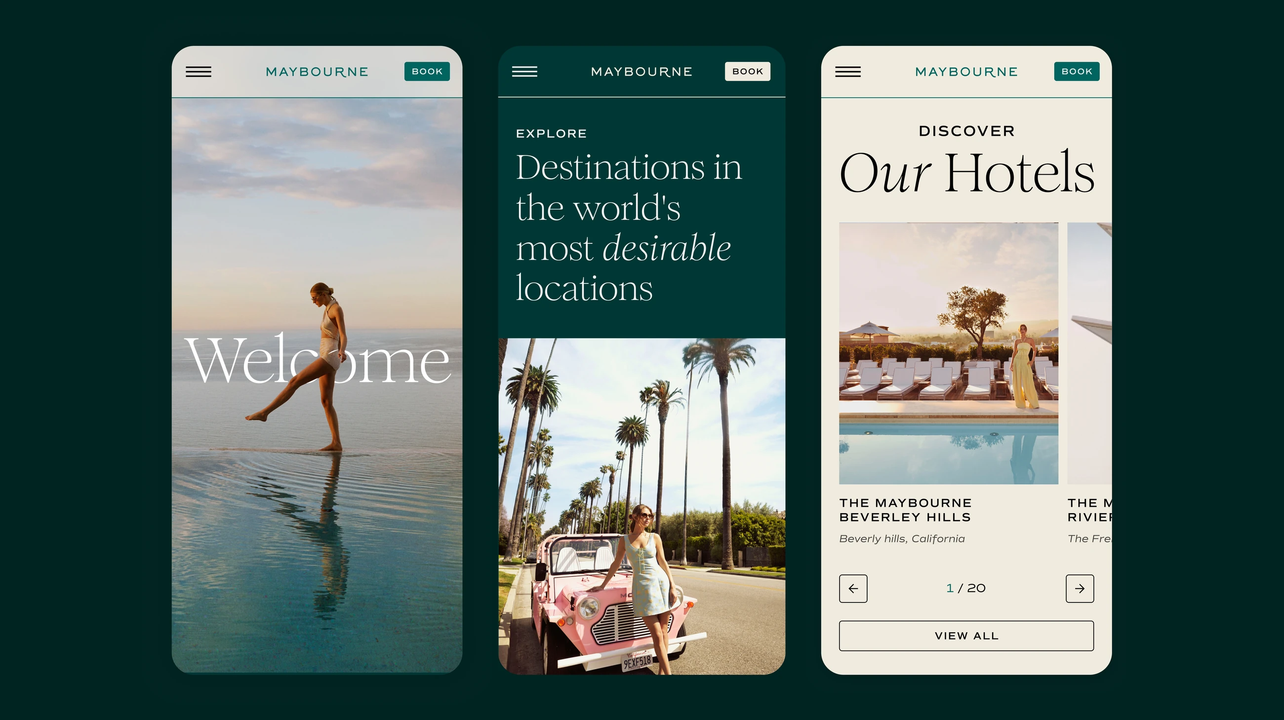
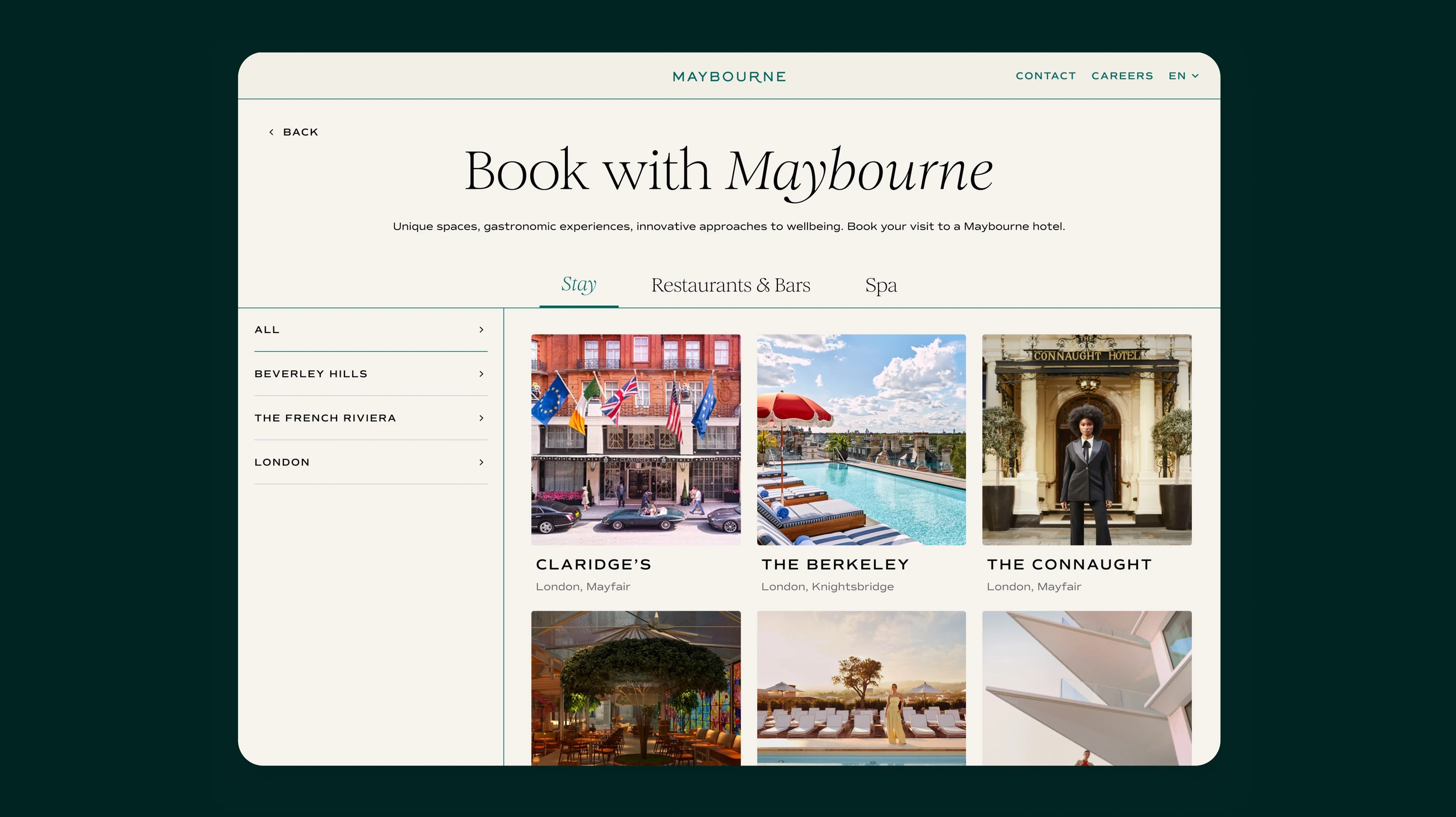
Scope: A single booking flow and shared design system underpin six properties and the corporate platform, so guests move from brand site to confirmation without leaving the group.
The tension sat in plain sight from week one. Brand wanted distinction across six voices; revenue wanted conversion through one predictable booking flow. Guests trusted the brand but not the booking.
Everything that followed came from resolving that conflict rather than choosing a side.
My role
Shipped
- 01Rebuilt six hotel sites and the corporate platform on 20+ shared templates
- 02One booking flow shared across six properties and the corporate platform
- 03Reset structure around three pillars and the journeys carrying revenue
- 04Let 500+ surveyed guests shape editorial so booking had less to do
- 05Held six brand voices on 60+ shared components, no per-property fork
- 06Handed over a platform the in-house team ships against without an agency
Research & understanding
Research earned its place by what it settled.
What we investigated
15+ stakeholder and guest interviews, analytics across existing sites, and a measurement framework agreed before design started.
How guests arrive
A 500+ response survey set three guest profiles and 20+ archetypes, each opening the site differently.
Structure, tested
Card sorting and tree testing set labels and hierarchy before layout, so IA was tested rather than argued.
What we learned & what it meant
INSIGHT
What we learned & what it meant
Key decisions
Let the editorial do the persuading, so booking only has to confirm.
The design phase
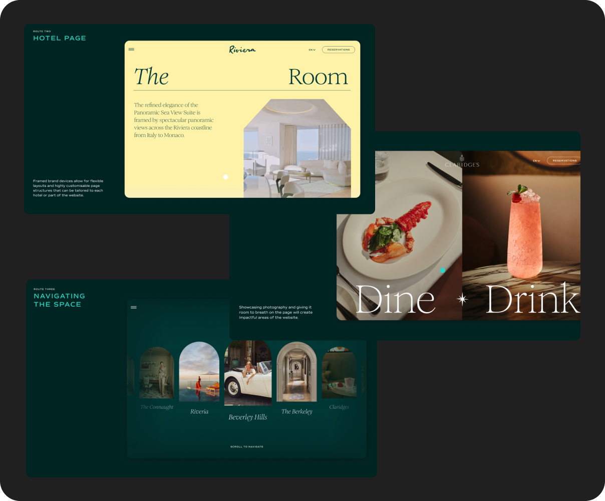
Concept exploration
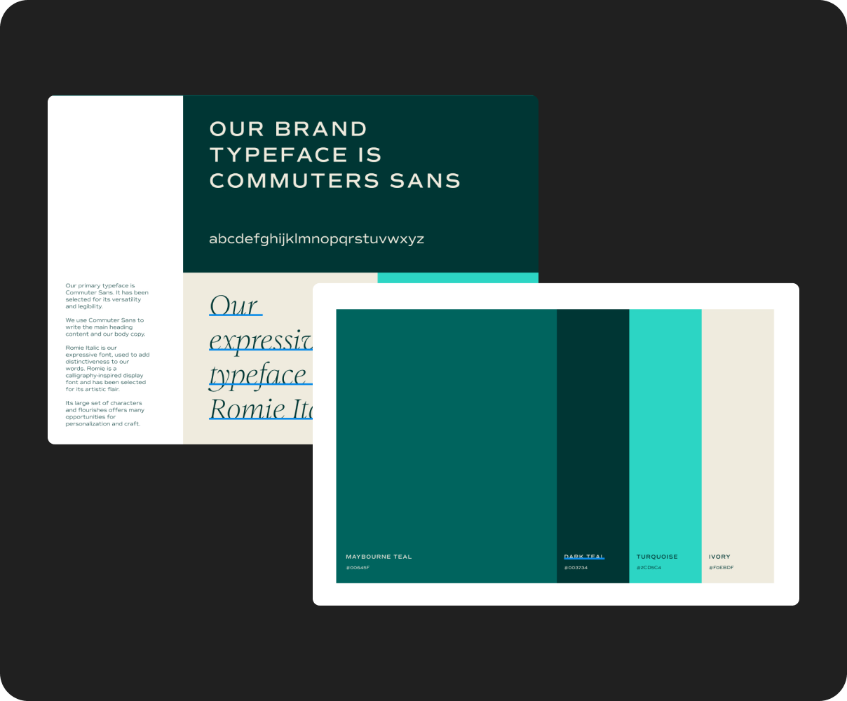
Design system
The website
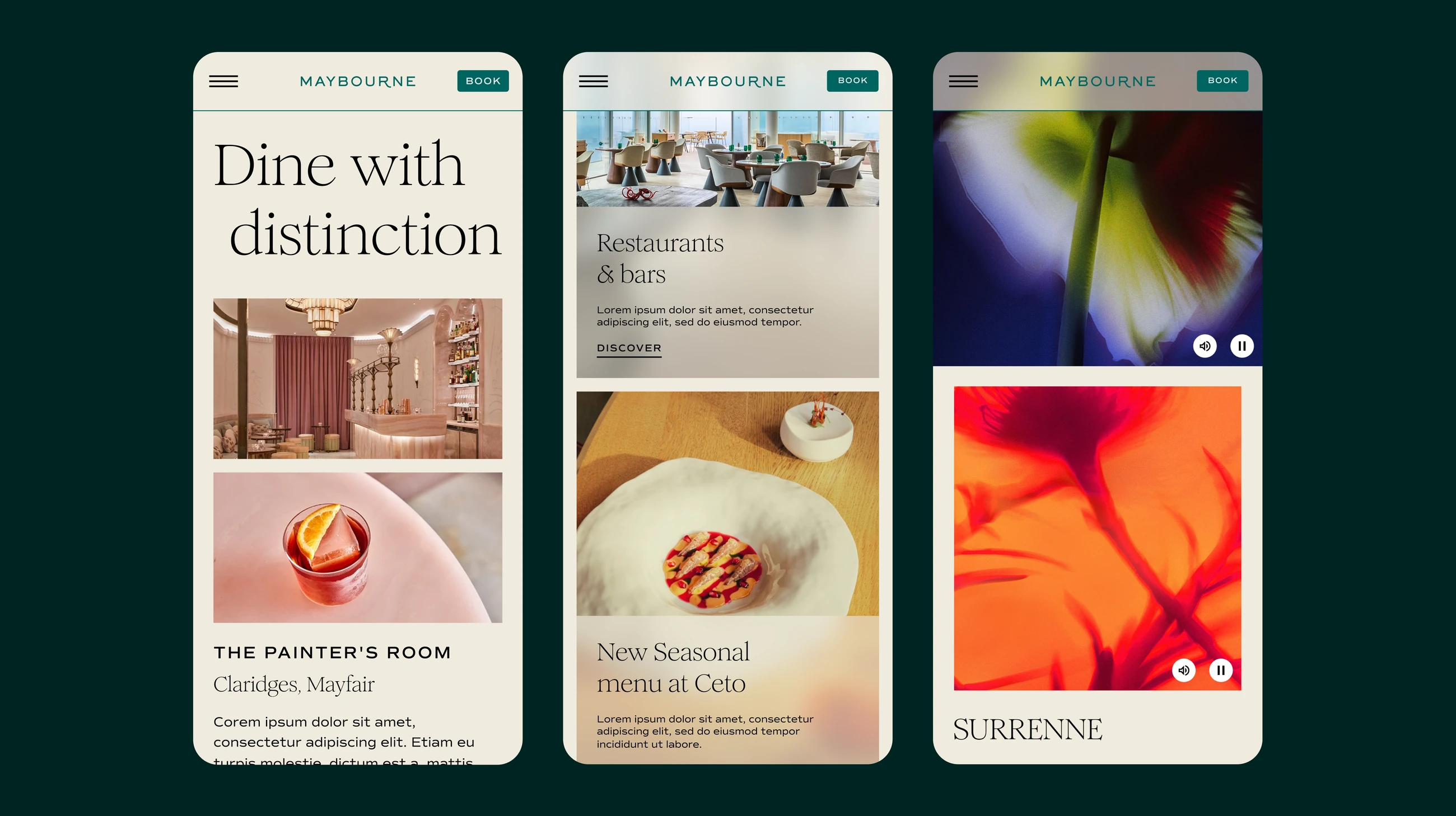
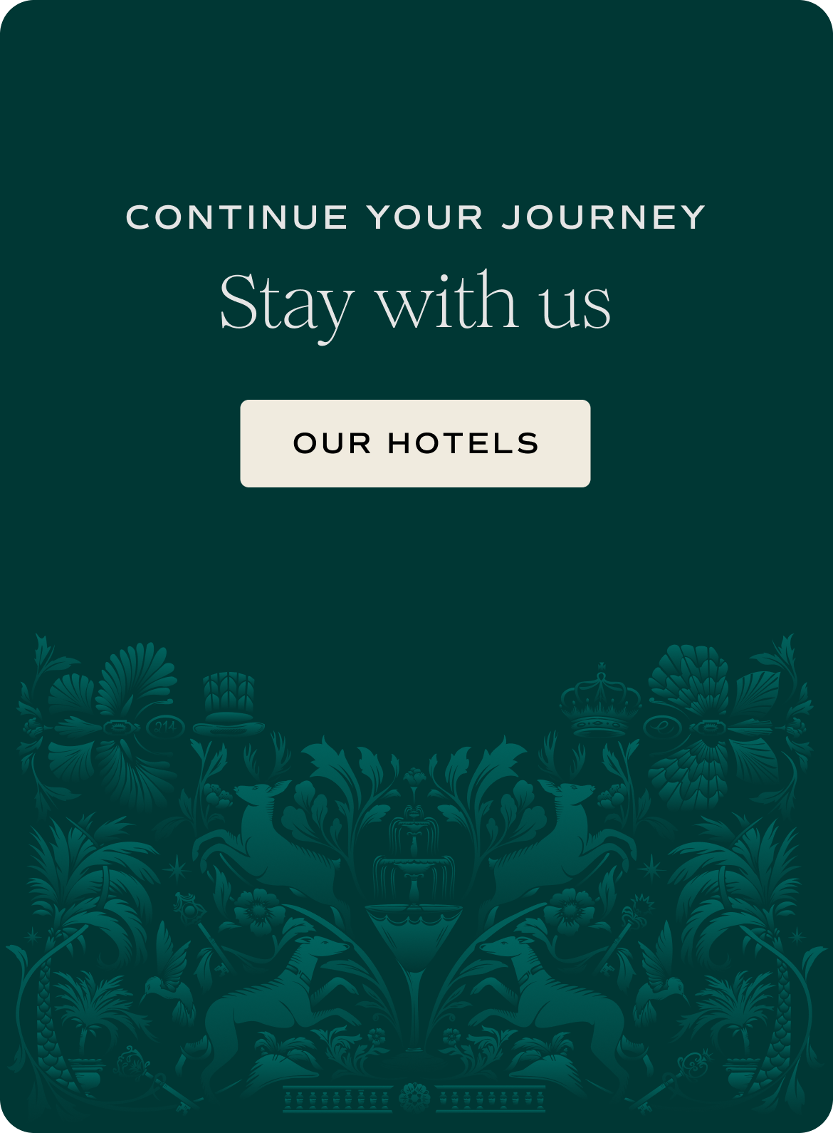
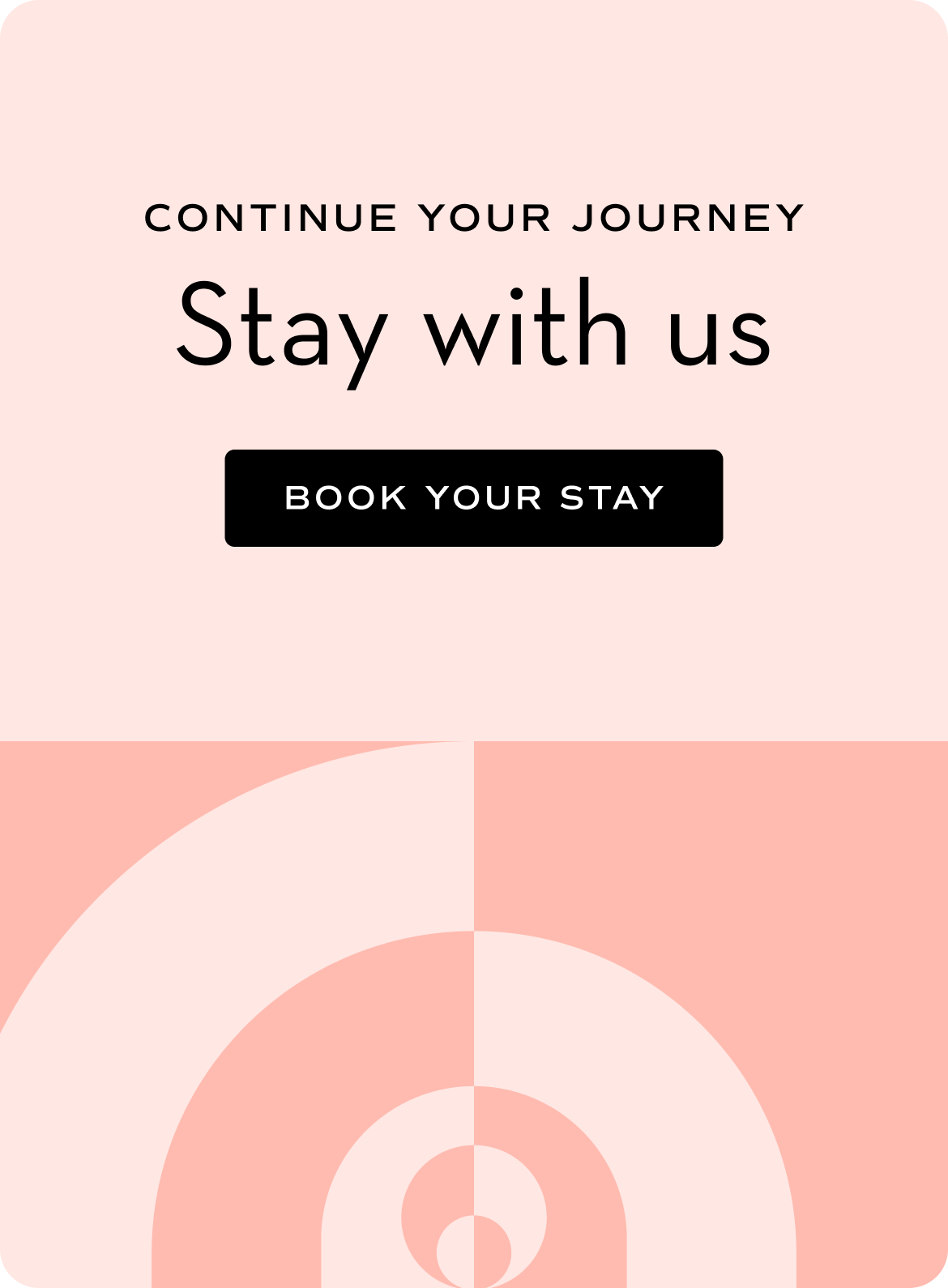
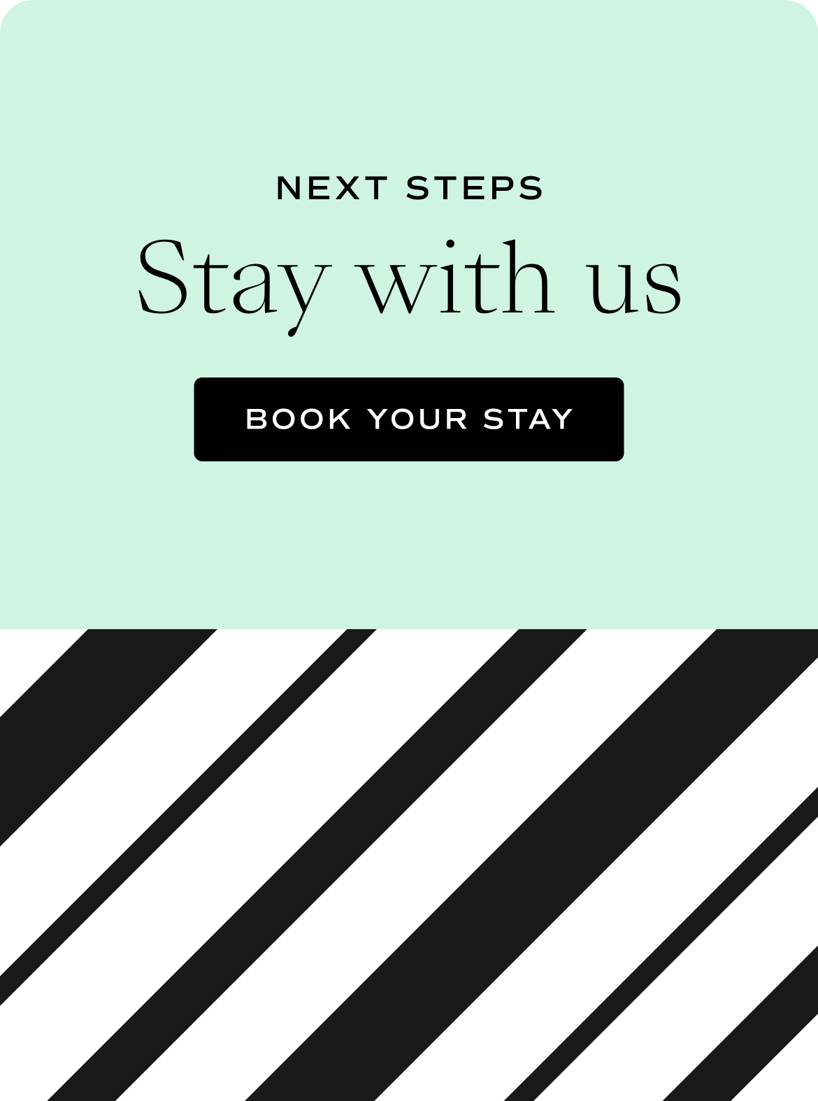
Six hotels, one unmistakable Maybourne.
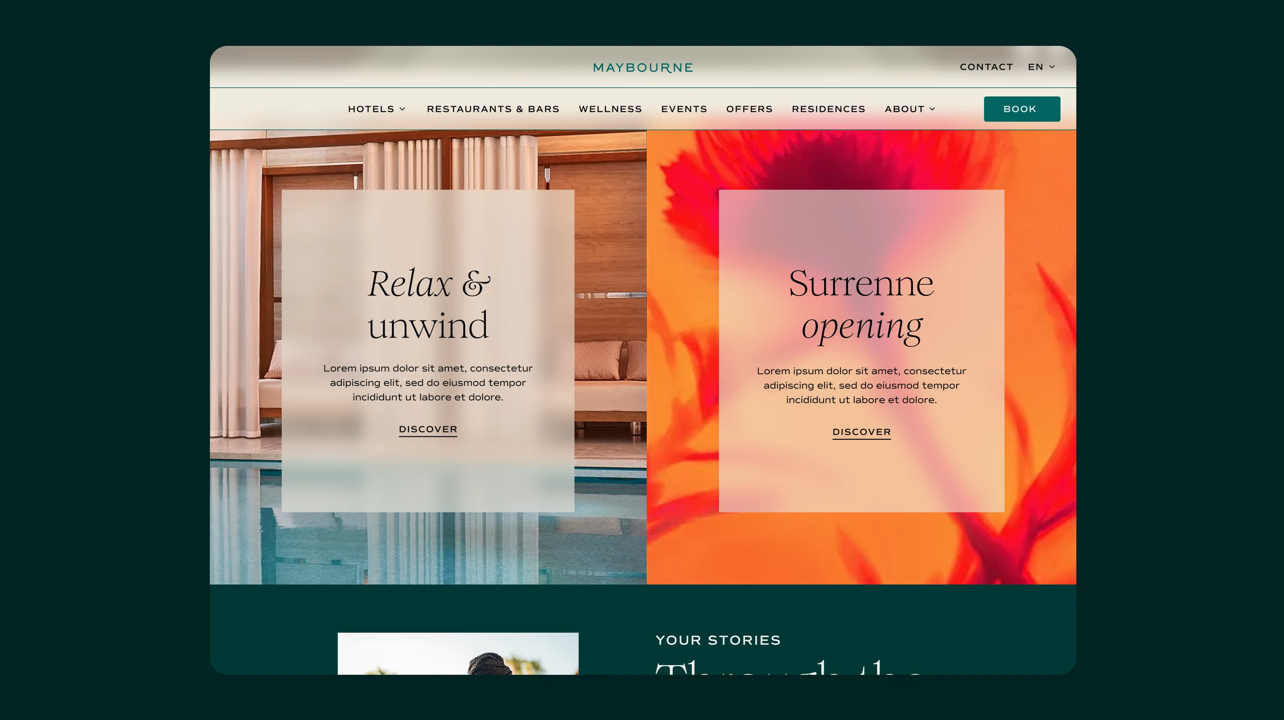
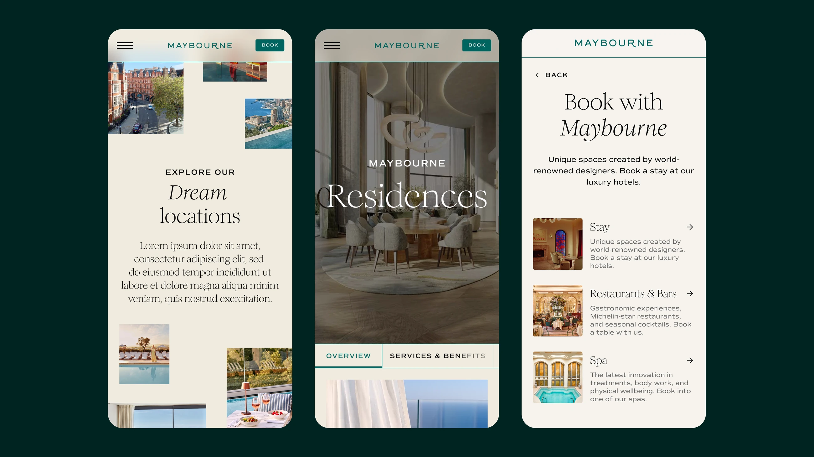
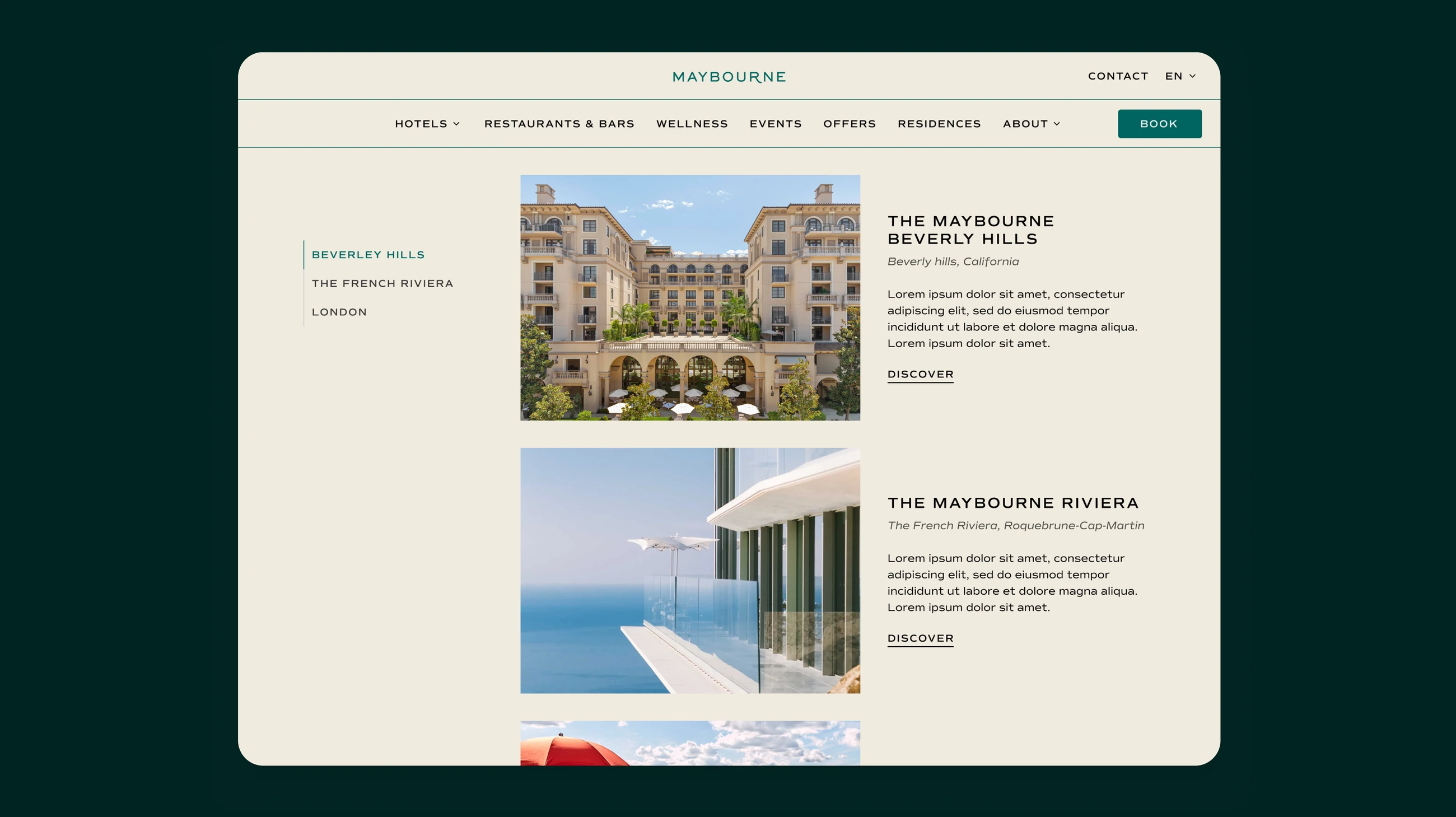
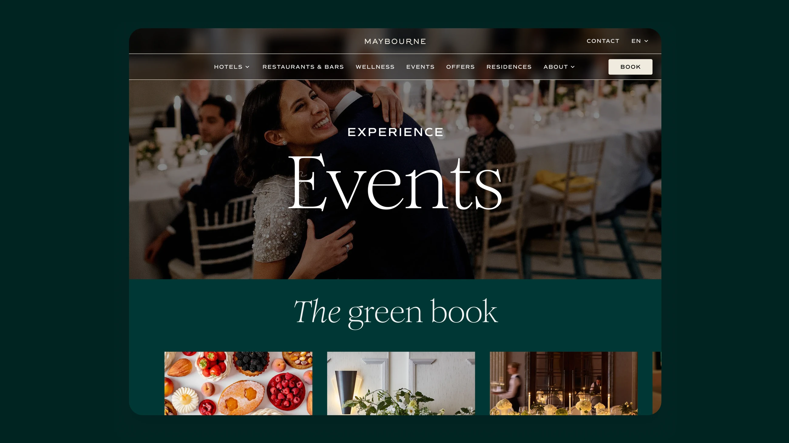
The hotel sites
Testing & validation
What we tested
Tree testing on the new structure, then 15+ sessions on booking and key editorial templates.
What we learned
Guests navigated confidently once labels matched their language, but hesitated when rates appeared late.
What changed
Labels and hierarchy revised, rate visibility moved earlier, and direct-booking and OTA measurement handed to the in-house team.
Outcome
A platform Maybourne can grow into, six brands today, the next property without a parallel design build.
Delivered the corporate platform, six hotel sites, the shared booking experience and the design system underneath, handed over to the in-house team to ship against.
Key decision: held six brand voices on one product system instead of forking it per property. Tighter constraints on each hotel, but a new property can launch without a parallel design build.
Other case studies
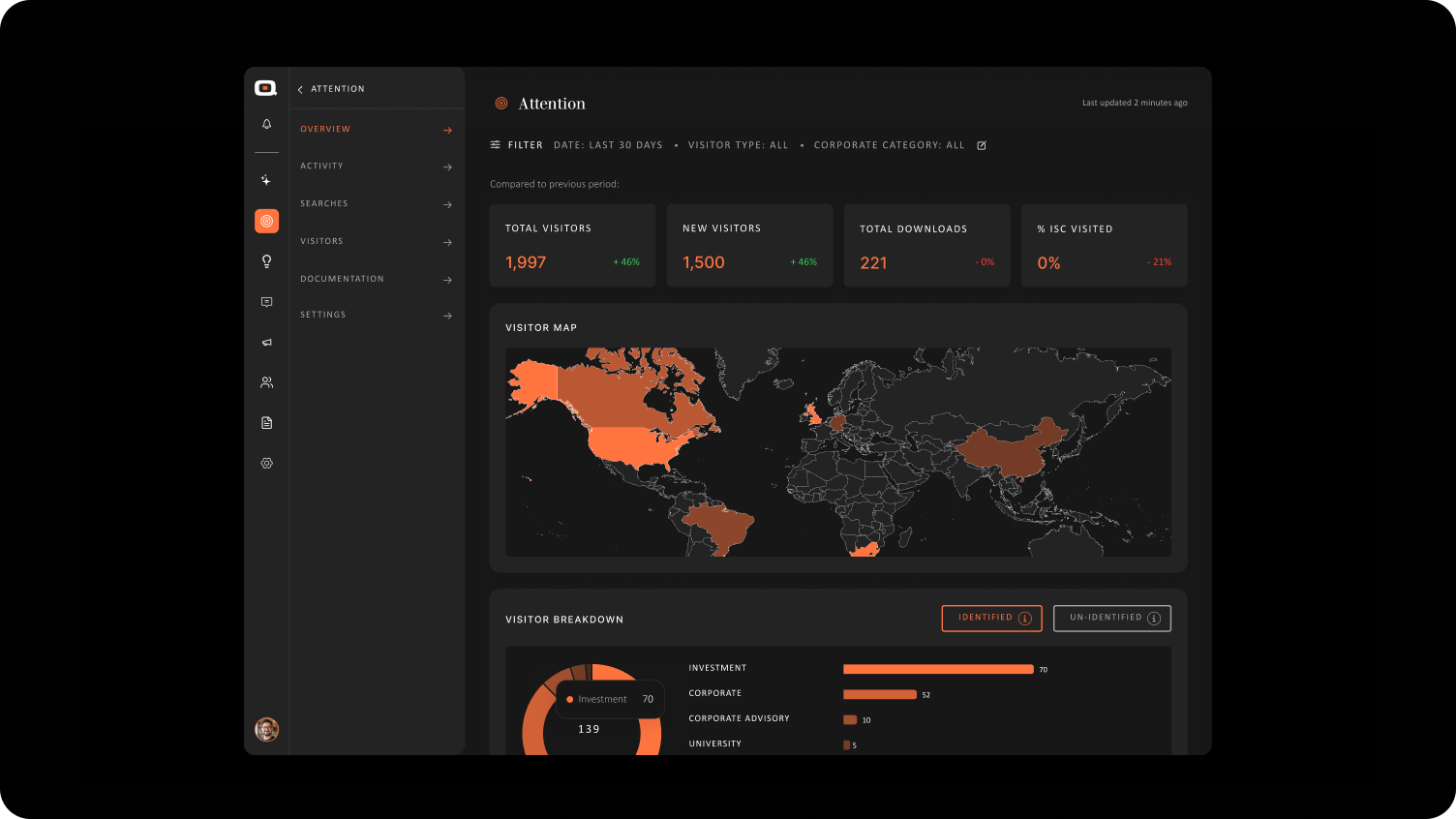
Quantifire
ViewProduct · B2B Intelligence · 2026—ongoing
A dashboard that turns scattered signals into decisions.
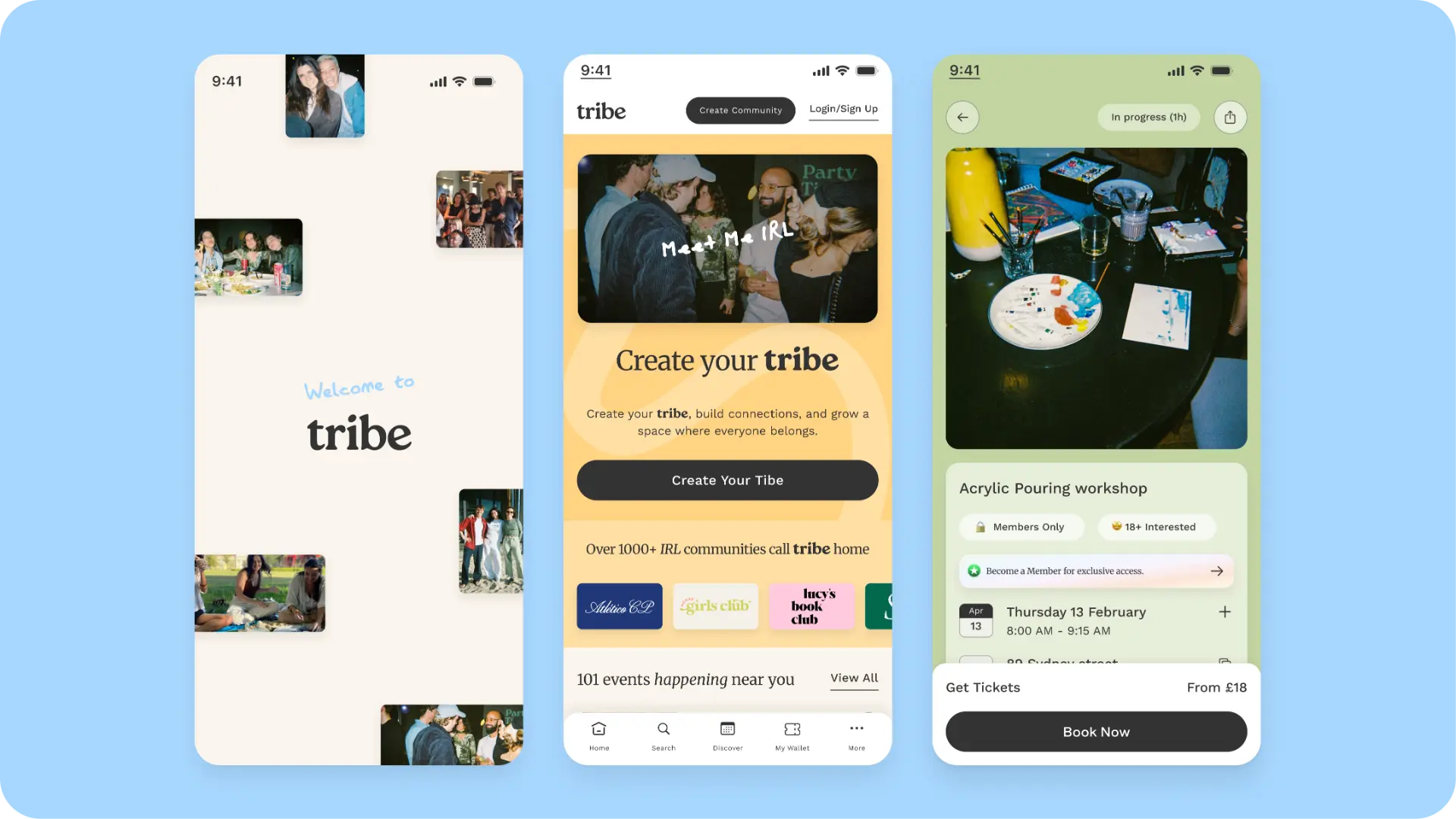
Tribe
ViewProduct · Community · 2025—ongoing
Memberships, events and ticketing as one connected product.
OVO Energy
ViewMobile App · Everyday · 2024
An energy app built around the questions people actually ask.