
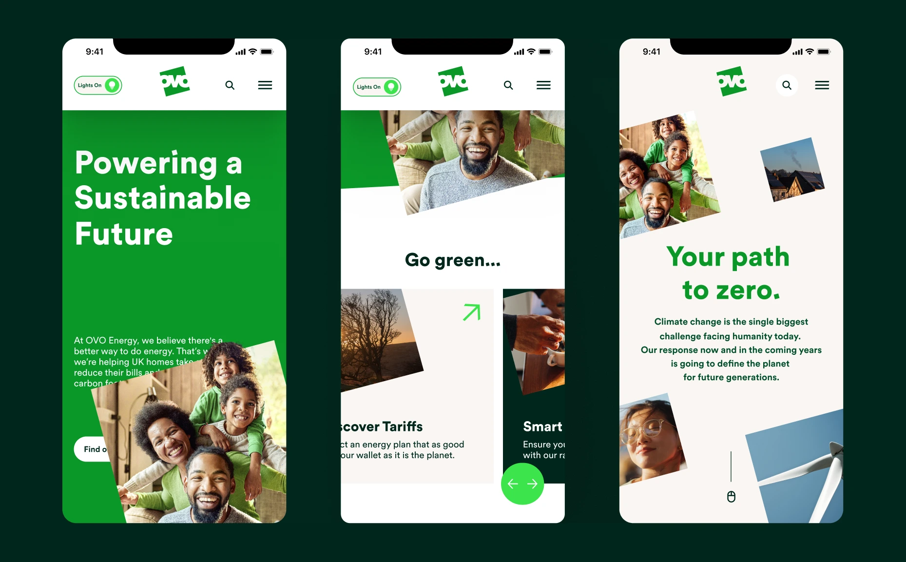
OVO Energy's customer app, used daily by millions of UK households. A home screen carrying billing recovery, usage, meter submission and product upsell with no shared hierarchy, on top of tariff rules and regulatory copy that couldn't be paraphrased, and a support team answering the same five questions every week.
Overview
A daily app for millions of households, rebuilt around what customers actually open it to do, not what the org chart said they should.
Scope: Home screen, billing, usage, meter submission, support entry points, and the system the in-house team kept shipping against.
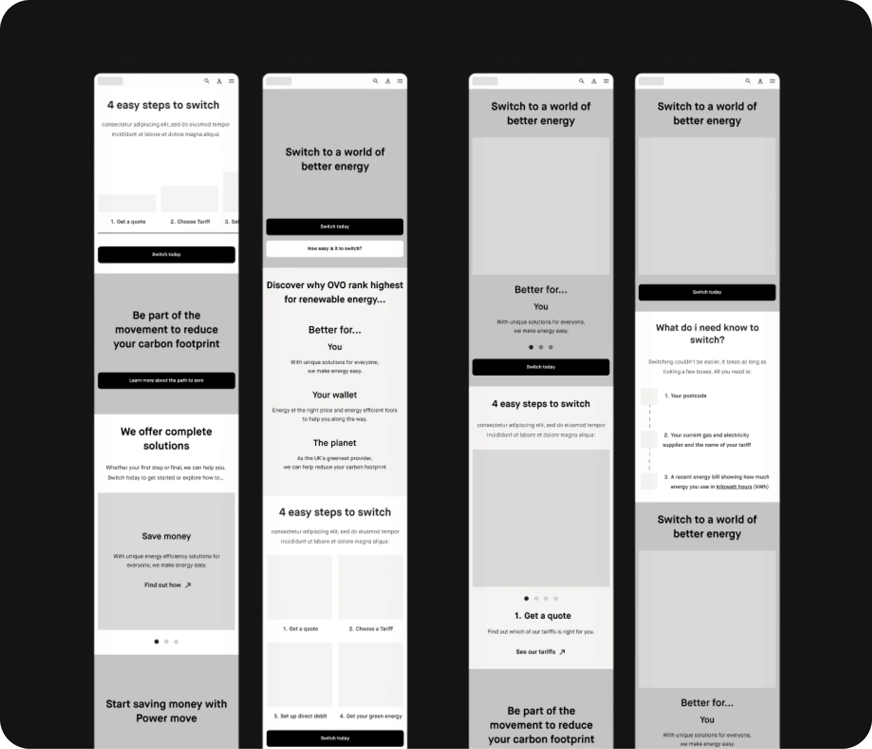
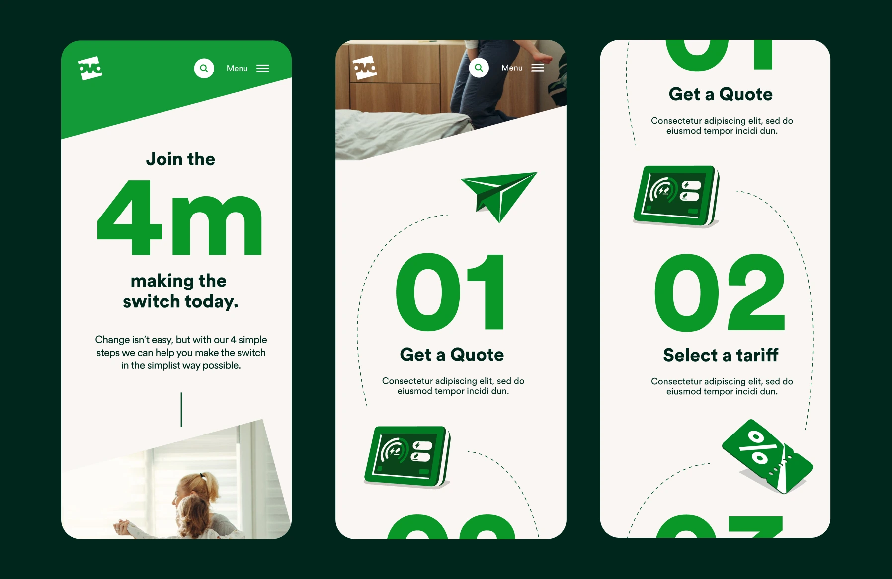
The hard part wasn't visual. The home screen carried billing recovery, usage, meter submission and product upsell with no shared hierarchy, on top of tariff rules and regulatory copy that couldn't be paraphrased. Support was the loudest signal in the room, the same five questions every week, all answers buried two screens deep.
Impact
- 01Built a measurement framework so the redesign had a bar to clear, not a tidier interfaceBuilt a measurement framework so the redesign had a bar to clear, not a tidier interface
- 02Made the home screen do one job in one glance for millions of householdsMade the home screen do one job in one glance for millions of households
- 03Shortened meter submission, the highest-volume support contactShortened meter submission, the highest-volume support contact
- 04Resolved the home-screen fight between billing recovery and upsellResolved the home-screen fight between billing recovery and upsell
- 05Held tariff rules and regulatory copy inside flows that read simplyHeld tariff rules and regulatory copy inside flows that read simply
- 06Co-built a system OVO has shipped against for two years without reworkCo-built a system OVO has shipped against for two years without rework
The Process
Discover
Understand the customer, the business and the existing product.
- Review & Kick off
- Business model canvas
- Measurement framework
- Staff interviews
- Website review
The Discovery Phase
Review & Kick off
Business model canvas
Measurement framework
Staff interviews
Website review
The Definition Phase
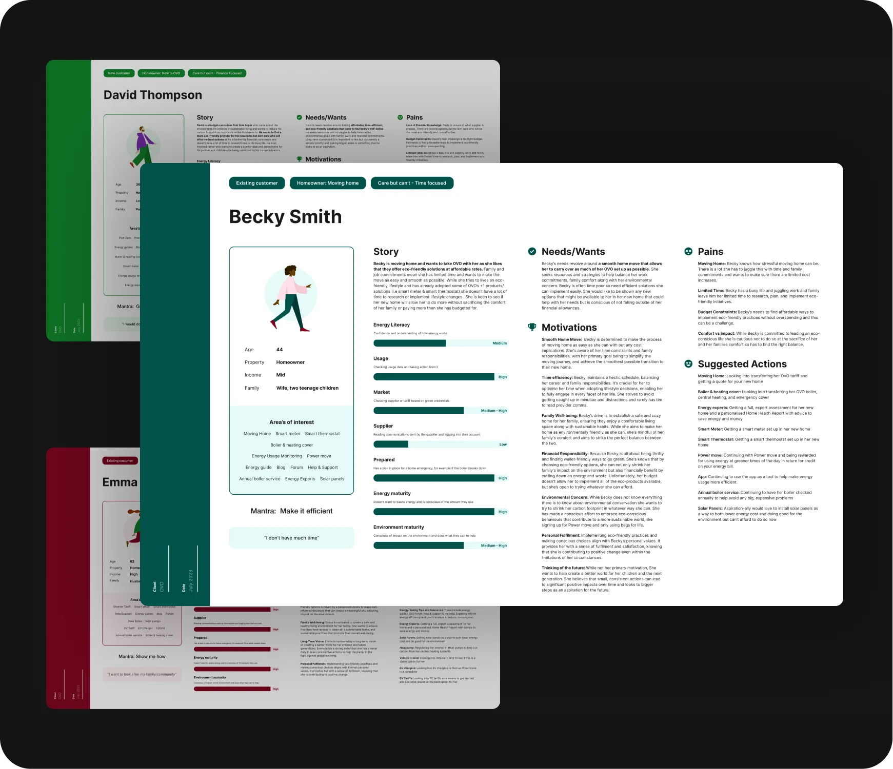
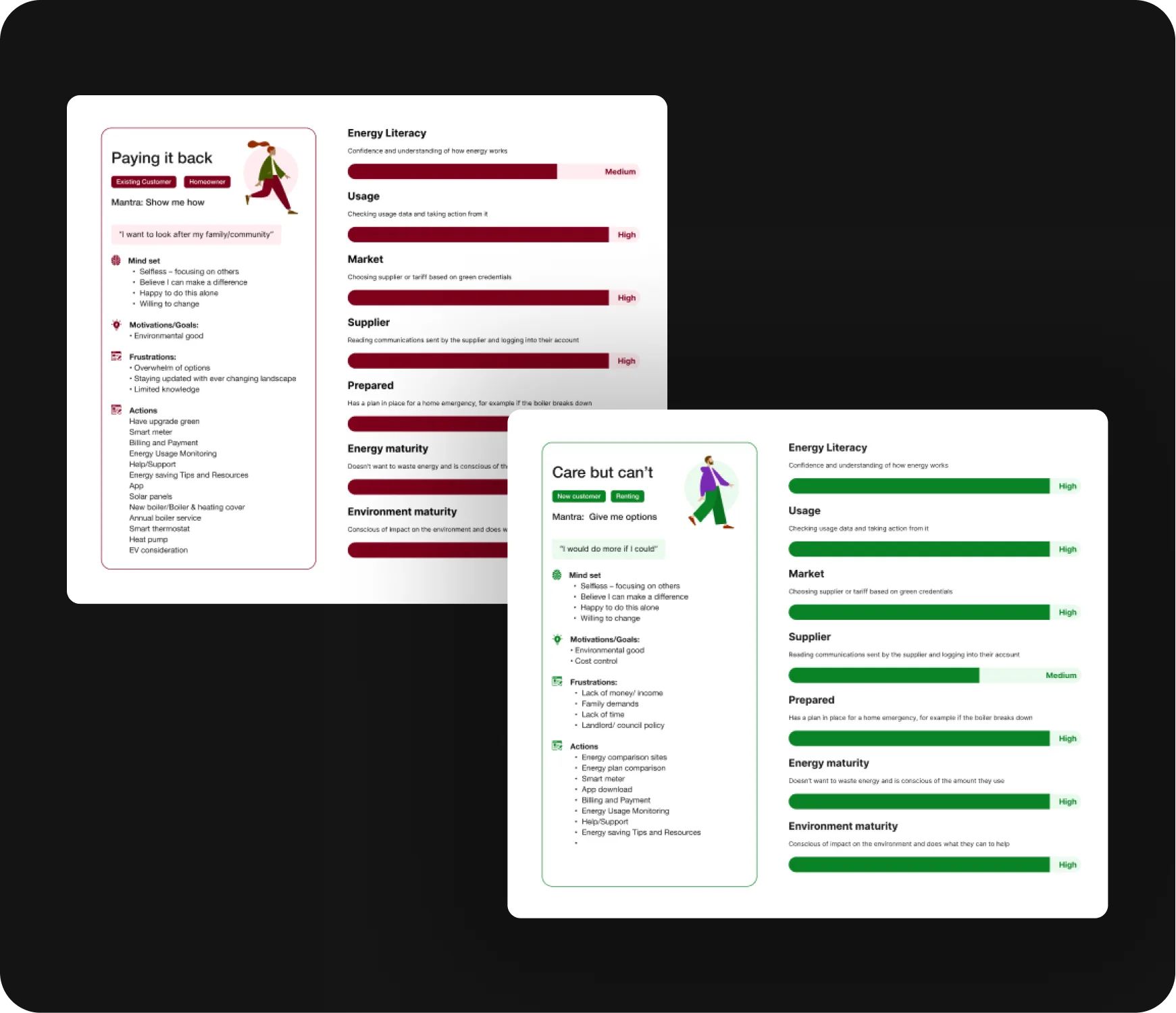
User archetypes & personas
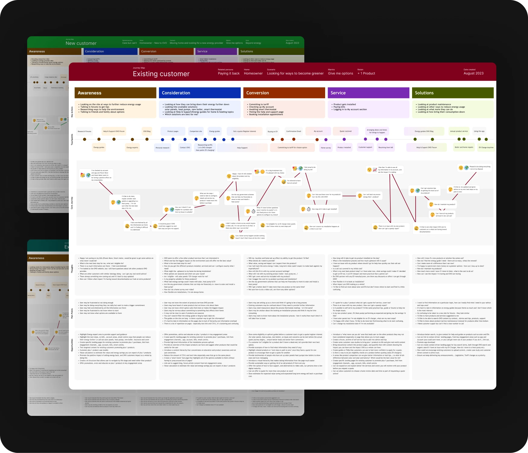
Customer journey mapping
The Ideation Phase
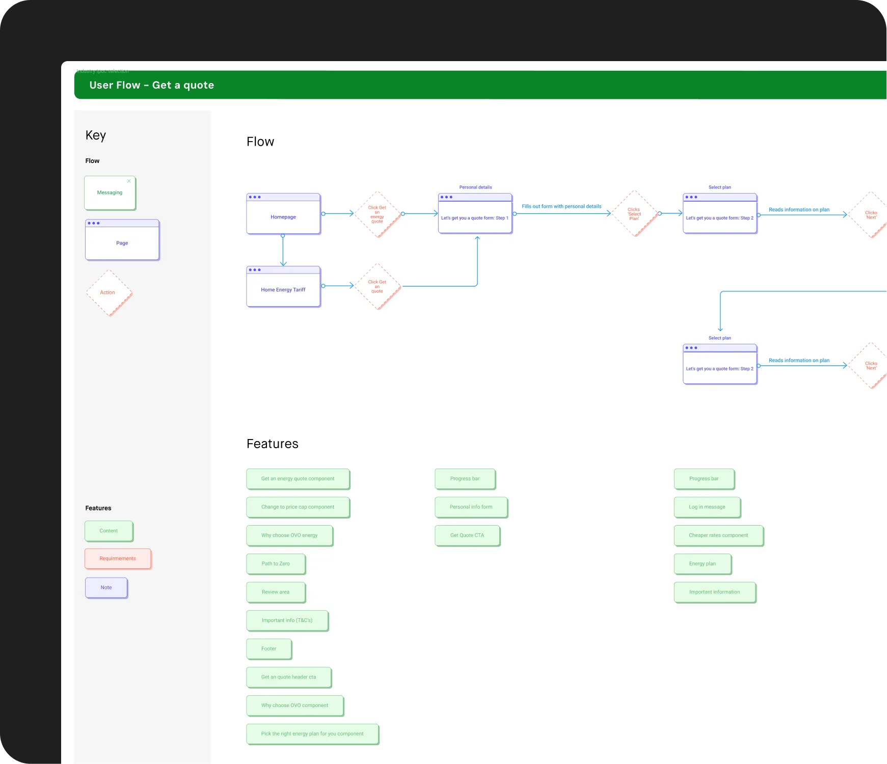
User flows
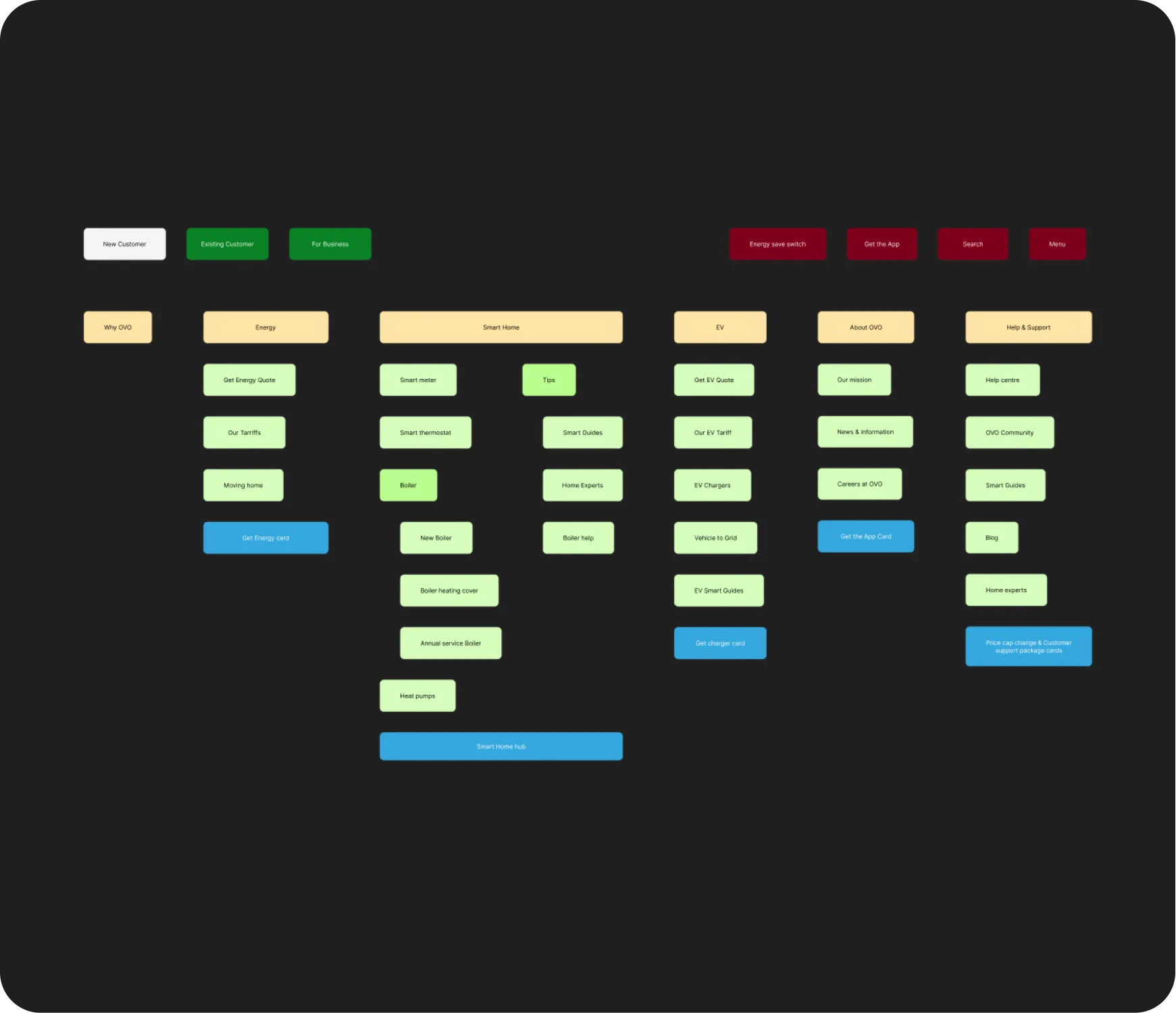
IA & Navigation wireframes
The Design Phase
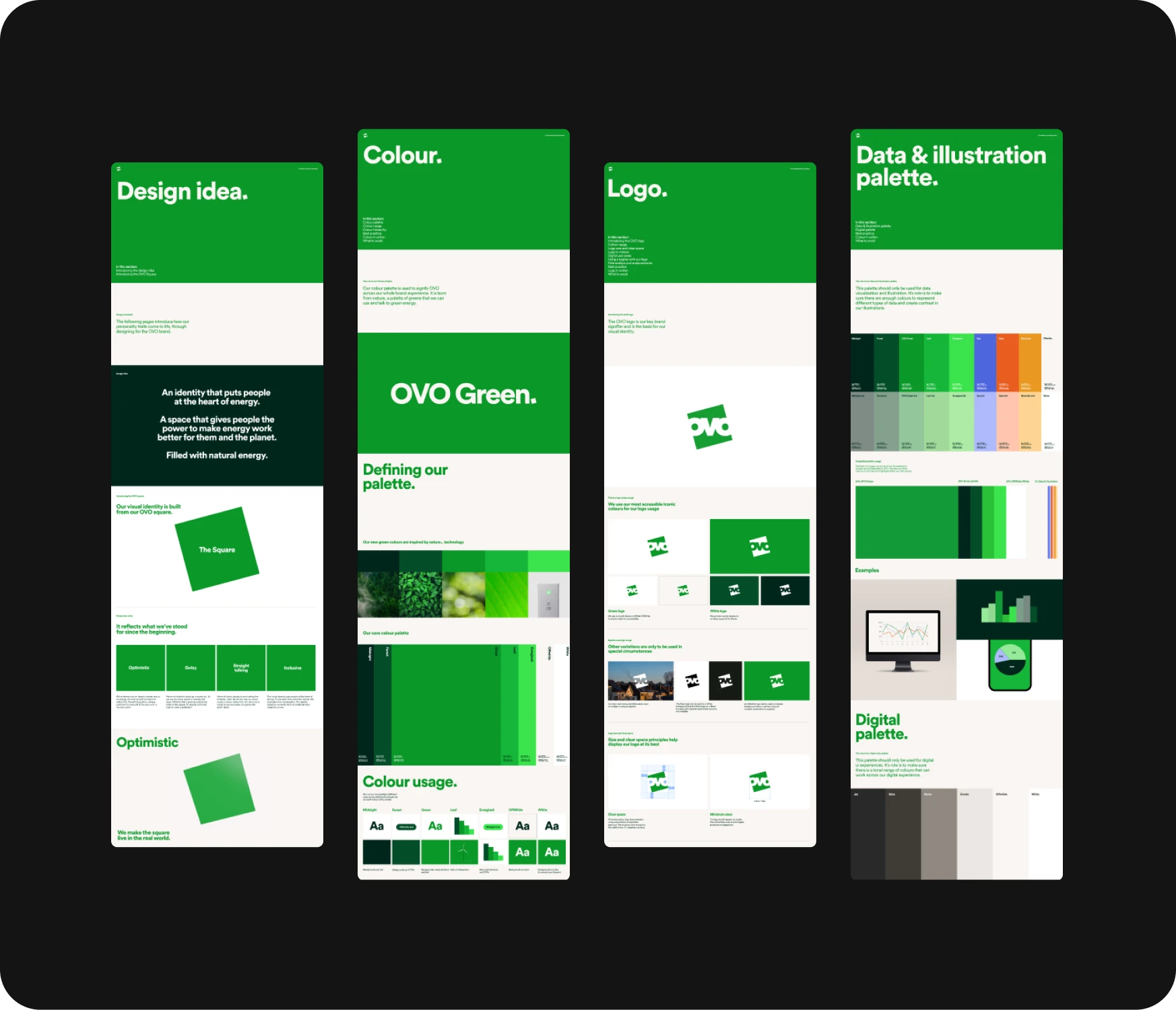
Visual audit
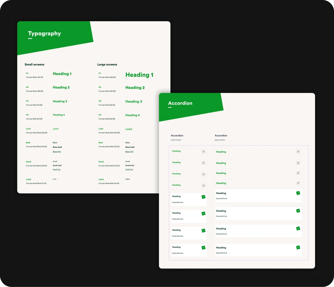
Design system
Wireframes
Concept exploration
Conclusion
A clearer app, and a design system the OVO team has now run, alone, for two years.
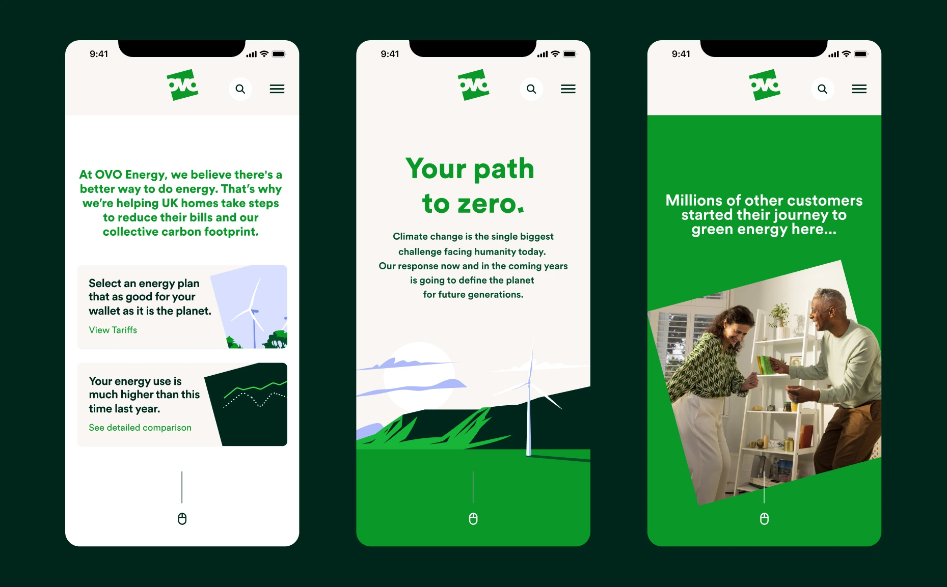
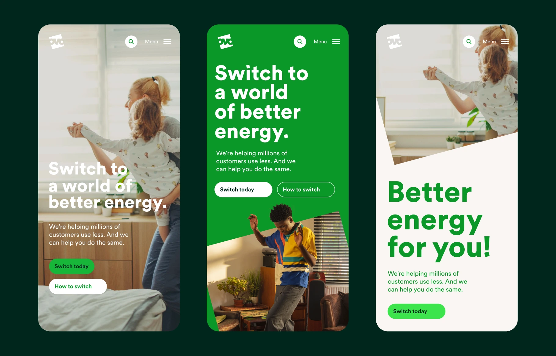
The home screen leads with bill, usage and meter reading, the three answers support gave most. Navigation is sharper, hierarchy survives mobile, and the journeys customers come for are noticeably shorter.
Key decision: led the home screen with account state over navigation. Cost some discoverability for secondary features; bought back the 30 seconds most customers were losing before they found their bill.