

Quantifire

Overview
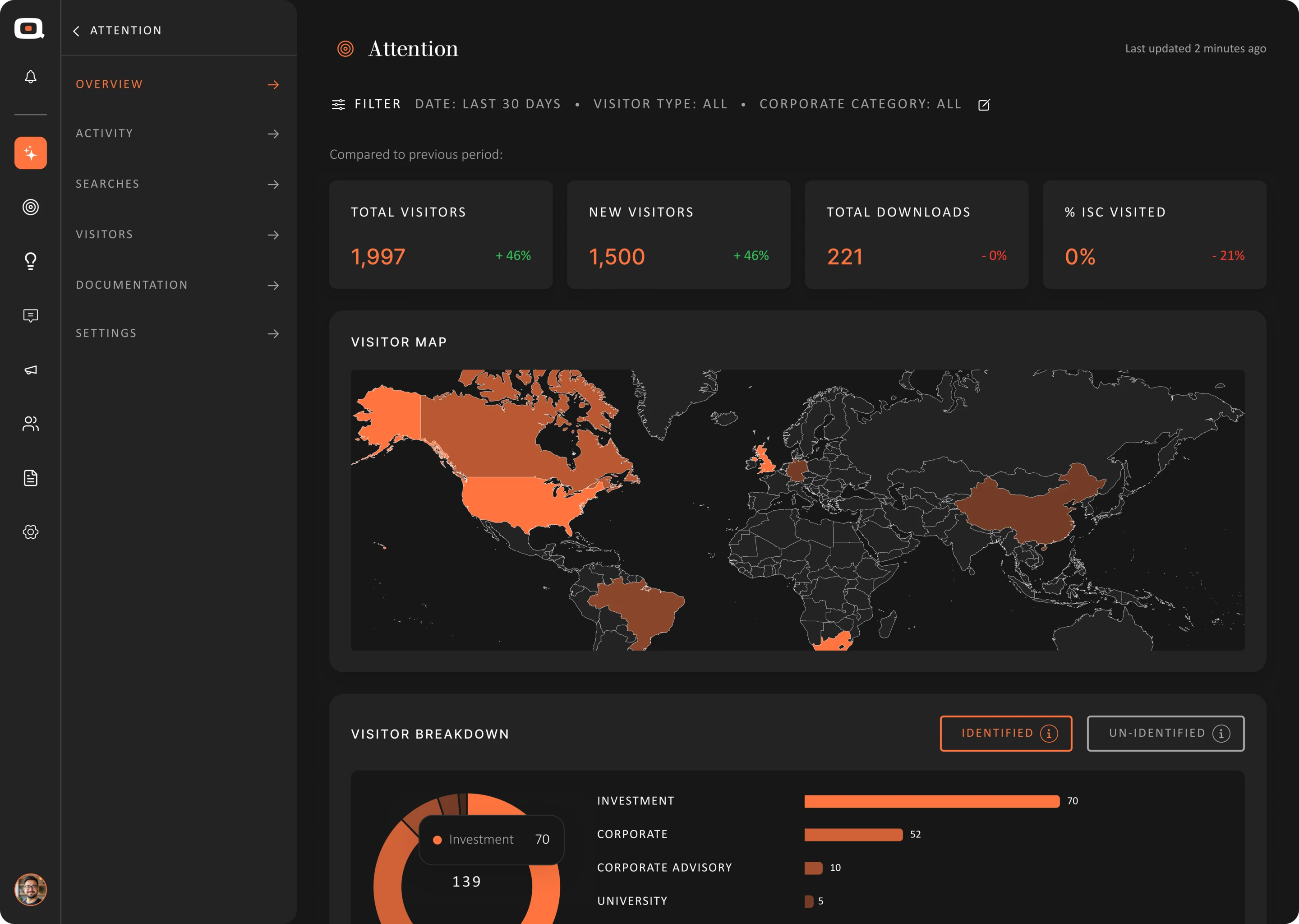
Quantifire’s investor intelligence began as static PDF reports for 100+ clients a quarter. It is now structure, dashboards, visualisation and an AI layer people can explore, interrogate and act on.
The data is dense: 550K+ answers from 6,000+ institutions carrying revenue, exposure, movement and sentiment, each with confidence and timing.
Anything outside that quarter’s report took days to answer. So the work was judgement: deciding what users need first, then building the patterns that carry them from summary to the line items behind it.
My role
Decisions
- 01Turned quarterly PDFs for 100+ clients into a product analysts interrogate
- 0280+ components specified once, each with interaction states, in light and dark
- 03Made structure, navigation and interaction behave identically across 50+ views
- 04Kept overview and line item comparable, so deep exploration never loses its context
- 05Spent colour only on financial meaning, so the signal that matters reads first
- 06Iris Core - chat, projects, knowledge base and Market Radar as one workspace
The Product

Layered by question

Signal over volume

What it replaced
Complexity wasn’t the problem. Undifferentiated complexity was.


Hierarchy
Changes, signals and actions come before supporting detail.
Density
Dense views stay readable through hierarchy, detail intact.
Exploration
Keep detail one interaction away so the main signal stays clear.
Data Visualisation
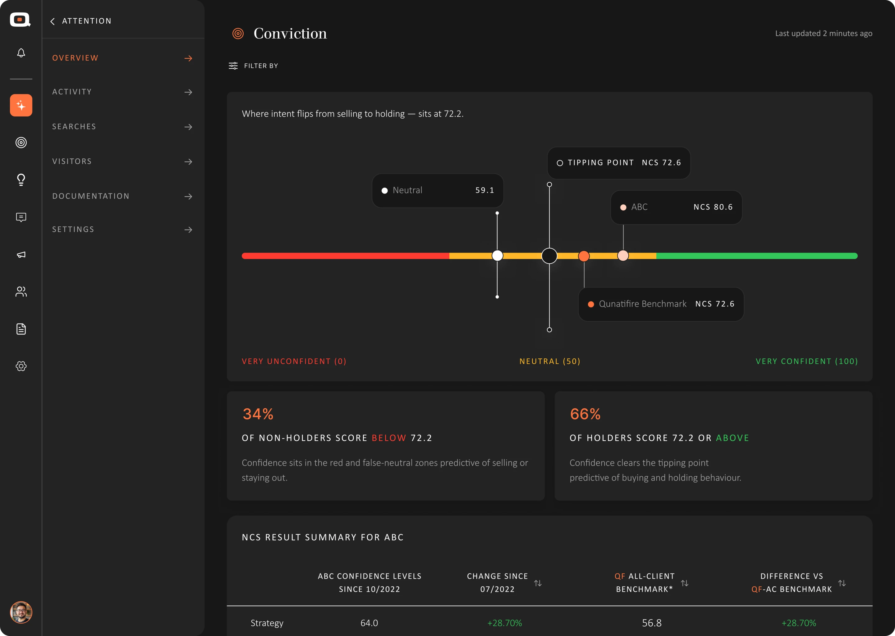
The goal was not prettier charts, but clearer signals from complex information.

Money movement, first

Comparable by default
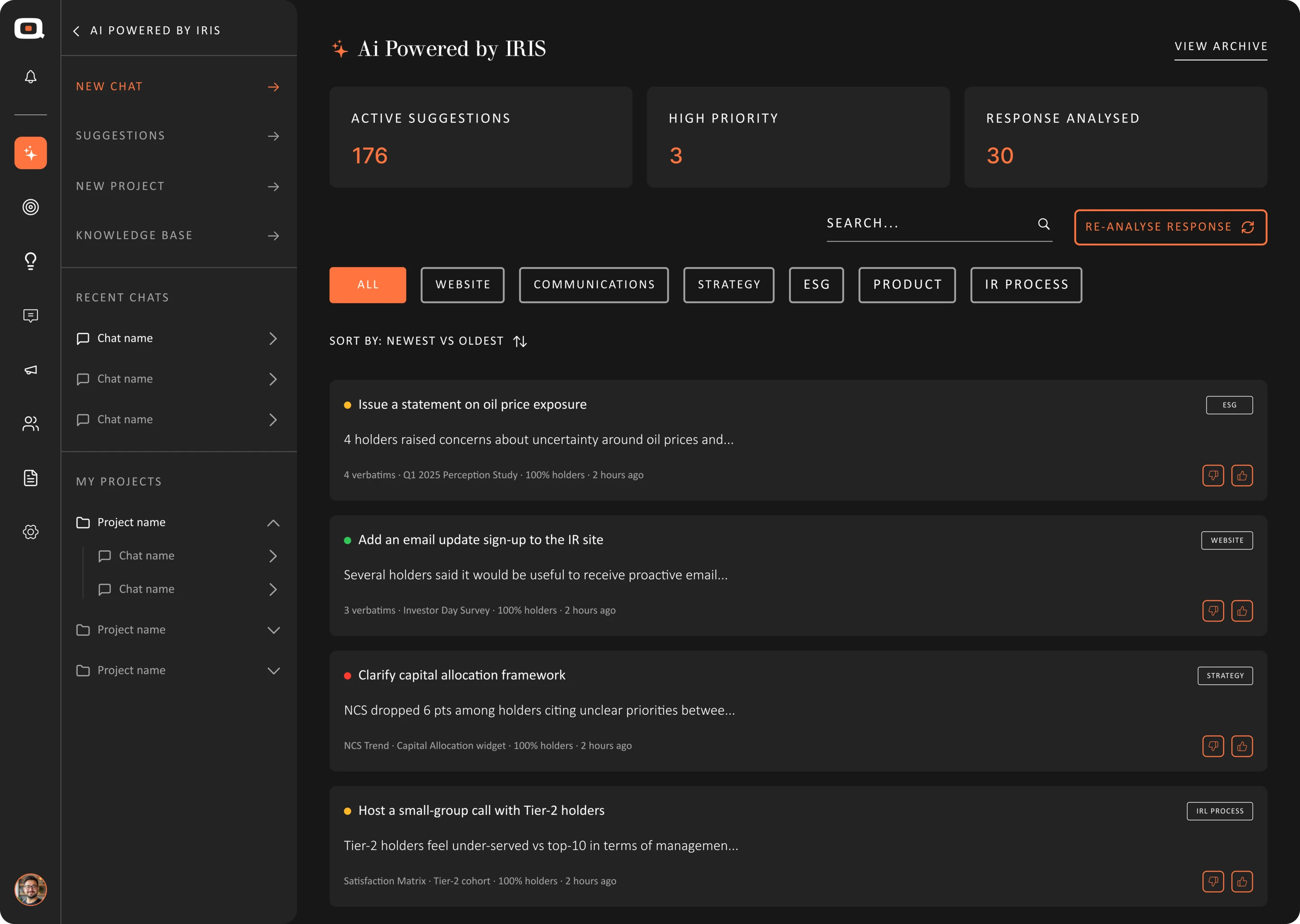
AI Powered by Iris
AI that understands the user, not just the prompt.
Iris connects projects, trusted knowledge and proactive insights into one workspace, embedded in the product rather than bolted on.


Chat
Natural conversation grounded in project data and context.
Projects
Conversations, files and AI organised around each project.
Knowledge Base
The trusted information Iris uses to understand project context.
Suggestions
Findings, priorities and next steps surfaced before you ask.
The Design System

Type & density scale
A tight ramp of data sizes keeps tables, captions and summaries locked in one clear visual hierarchy.

Data components
30+ cards, tables and 20+ chart patterns share one visual language, with empty, loading and low-confidence states built in.

Colour as signal
Colour is spent only on financial meaning and change against its starting point, so gain, loss and exposure read at any density.


Light and dark
The same components and tokens hold hierarchy, contrast and readability across light and dark modes, with no re-specification.
The Design System
Type & density scale
A tight ramp of data sizes keeps tables, captions and summaries locked in one clear visual hierarchy.
Data components
30+ cards, tables and 20+ chart patterns share one visual language, with empty, loading and low-confidence states built in.
Colour as signal
Colour is spent only on financial meaning and change against its starting point, so gain, loss and exposure read at any density.
Light and dark
The same components and tokens hold hierarchy, contrast and readability across light and dark modes, with no re-specification.
Conclusion
Fixed reporting became a product users can interrogate, and a system dense enough to grow into.
Hierarchy became a product decision, not a styling one. Early versions mirrored the document; later rounds cut a third of the charts so users land on the view answering their first question.
Key decision: kept Quantifire desktop only. It cost reach, but bought the room this data density needs.
Other case studies
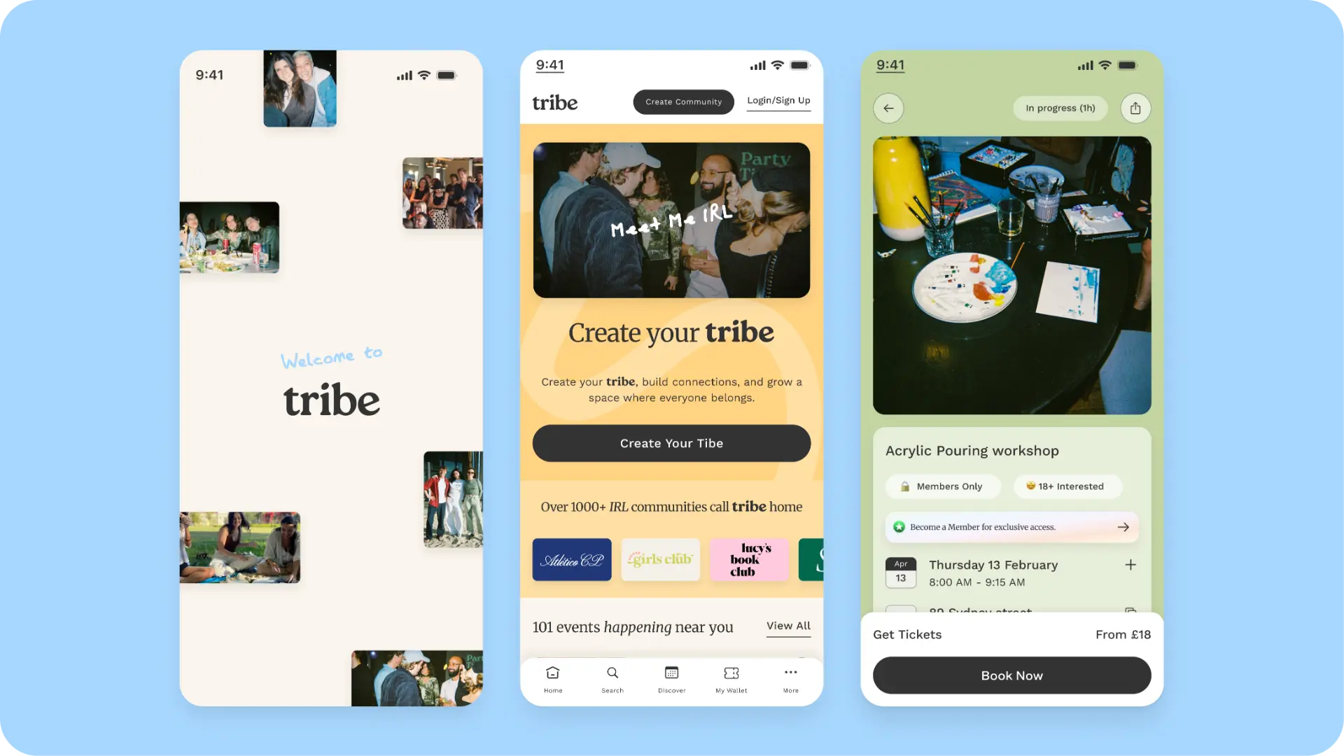
Tribe
ViewProduct · Community · 2025—ongoing
Memberships, events and ticketing as one connected product.
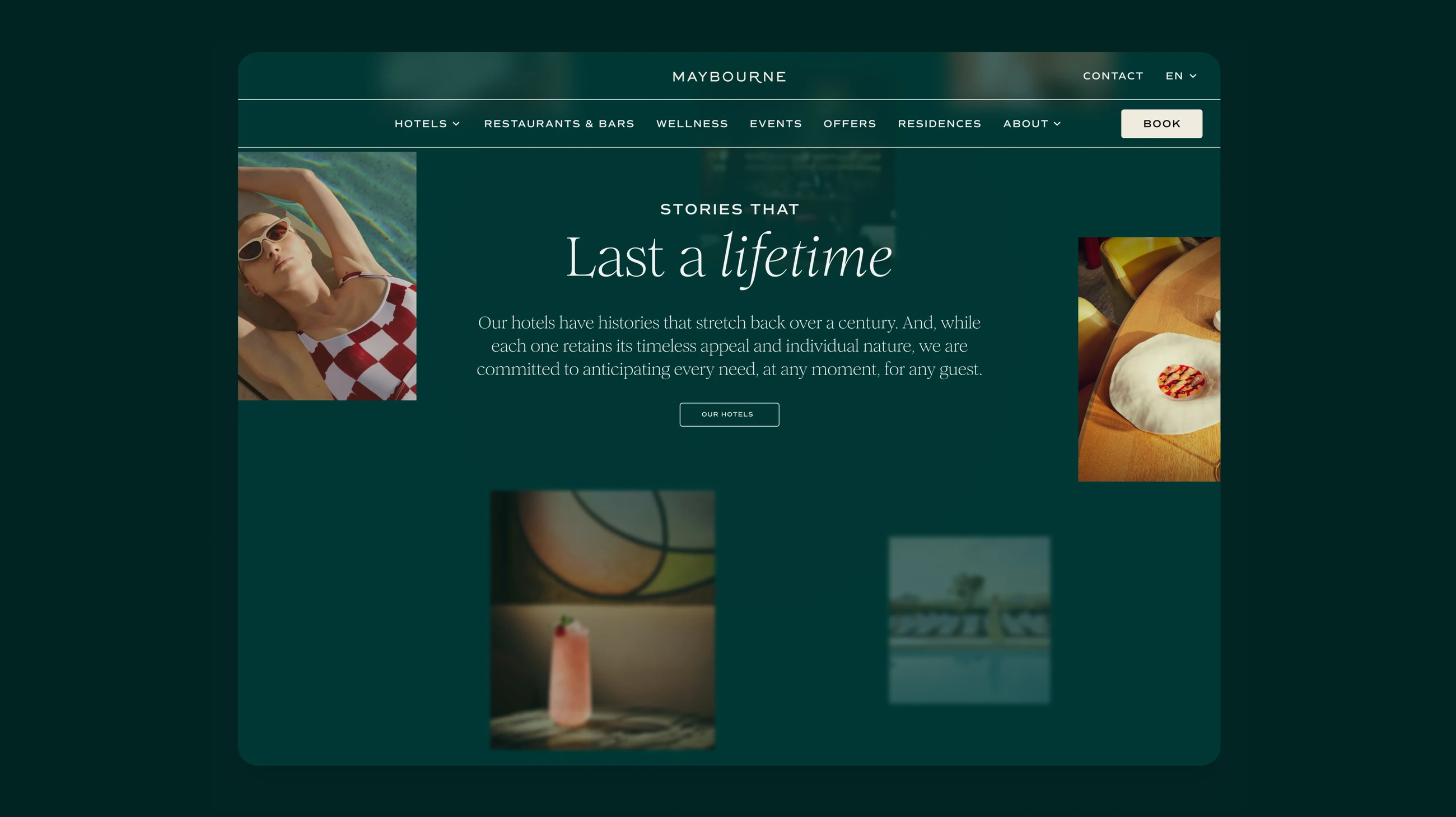
Maybourne
ViewWebsite · Hospitality · 2025—26
IA, UX/UI and a design system across six luxury properties.
OVO Energy
ViewMobile App · Everyday · 2024
An energy app built around the questions people actually ask.